Hello! I’m Alexandra Mirgheș 👋
UI/UX Designer
31, UI/UX designer based in Bucharest.
With a background in branding, graphic design and photography, I bring a strong sense of visual aesthetics to my work.

About me
I am a designer who has had the pleasure of working with various clients from different markets, ranging from small businesses to giants such as telecom, automotive, and banking.I strongly believe in ethical design, accessibility, and creating clean interfaces that are easy to navigate for all users. My goal is to create meaningful and delightful experiences for people while keeping the focus on the user's needs and goals.When I'm not designing, you can find me hiking and enjoying nature, photographing and editing, handcrafting random things , playing with animals or buying too many plants 🌿
Projects
Some of the visual identity elements, app and client names have been changed.
City Social
Mobile app aimed at building caretakers to fulfill their daily tasks digitally with an extended focus on accessibility.
Campaign Studio
Webapp that helps internal business units collaborate with external contractors and advertising, media, and communication agencies.
ETM.next
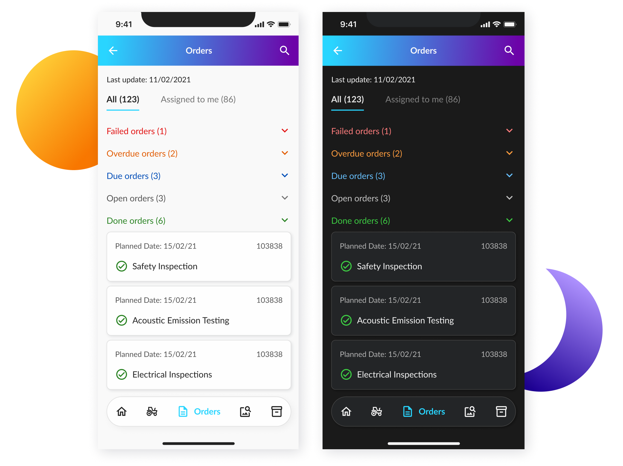
Award-winning app for requesting, planning, dispatching and billing as well as full life cycle management for critical assets.
AIB
Intranet webapp solution for one of Ireland's biggest banks, focusing on employee and human resource processes.

Alexandra Mirgheș
UI/UX Designer
31. Bucharest.Looking to be part of a fun and new environment!
Work Experience
2024 - Present
User Experience Designer @Lobyco
Bucharest, RO
As a UX Designer at Lobyco, I play a pivotal role in shaping the digital experience for one of the largest grocery store chains in Romania, while also contributing to projects for global clients. My work combines creativity, research, and collaboration to deliver intuitive and impactful design solutions.
Key responsibilities include:
UI Design: Designing and maintaining user-friendly interfaces for app pages, ensuring seamless interactions and visual appeal.
User Research & Testing: Conducting user interviews, co-design workshops, and analyzing user reviews to uncover insights. I also perform hands-on testing to validate and refine new features.
Data-Driven Analysis: Leveraging qualitative and quantitative data to inform design decisions and ensure solutions align with user needs and business objectives.
Competitor Analysis: Staying informed on market trends to identify opportunities for innovation.
Accessibility & Standards: Ensuring designs meet accessibility requirements and usability standards, fostering inclusivity for all users.
Agile Collaboration: Working closely with cross-functional teams, including QA, customer success managers, integration leads, product owners, developers, clients, key stakeholders and other designers, within an Agile framework.
Design System Stewardship: Maintaining and evolving the design system to ensure consistency and scalability.
Global Engagement: Tackling diverse projects for clients worldwide, demonstrating adaptability and cultural awareness.
This role empowers me to combine user-centered research with practical, hands-on design, all while fostering collaboration and ensuring accessibility. My passion lies in transforming insights into solutions that enhance usability, accessibility, and business impact.
2018 - 2022
Product Designer @BearingPoint
Bucharest, RO
As a Product Designer, I was responsible for creating visually appealing and intuitive user interfaces for web and mobile applications. My role involved leading design initiatives, conducting user research, and collaborating with cross-functional teams, product owners, testers, developers and clients to create engaging product experiences. Besides doing various design projects like mobile and web apps for BearingPoint, I have worked with clients from a wide range of industries. Some of them are Daimler, Vodafone, Henkel, Allied Irish Banks, Paris Social Services.
Responsibilities:
Designed and created wireframes, mockups, and prototypes for web and mobile applications
Designed graphics for various use-cases such as internal apps, branding items, corporate events, presentations
Conducted user research and used UX research tools and exercises to understand user needs and behaviours
Collaborated with product managers and developers to ensure that the user interface design was feasible and met technical requirements
Conducted user testing to validate design decisions and make iterative improvements
Led design initiatives and facilitated meetings to drive innovation and creativity
Created and maintained design systems, style guides, and design patterns for both internal and external products
Conducted design audits and offered consultancy for already existing products
Coordinated photo sessions, photographed and did photo editing for BearingPoint’s social media campaigns
Stayed up-to-date with emerging design trends, technologies, and best practices
Mentored juniors and contributed to a positive team culture
2015 - 2018
Graphic Designer @Anda Film
Bucharest, RO
I was responsible for creating visual designs that brought products to life, with a focus on branding and visual identity: logos, posters, packages and stationery. Some of the industries I’ve done branding work for were entertainment, financial, food, health and various small shops and businesses.Using my skills in Adobe Creative Suite, I brought these concepts to life with attention to detail and a deep understanding of color theory and typography.Throughout my time as a Graphic Designer at this company, I remained committed to staying up-to-date with the trends and technologies, allowing me to continuously improve my skills and deliver even more impactful designs.
2014
Art intern @Next Advertising
Bucharest, RO
As my first work experience, I have gained valuable experience working in a fast-paced, creative environment. I have had the opportunity to work on a campaign proposition for a real product, collaborating with other members of the creative team.During my internship, I had been responsible for assisting in the development and execution of creative concepts and visual designs for print, digital, and social media campaigns. I have worked closely with copywriters, graphic designers, and other members of the team to brainstorm ideas, sketch concepts, and create mockups.Throughout my internship, I have had the opportunity to hone my design skills, develop my understanding of marketing and advertising strategies, and learn how to work effectively as part of a creative team. I have gained practical experience using design software, including Adobe Creative Suite, and developed an eye for detail, with the ability to create visually compelling designs that meet client needs and objectives.
Education
2015 - 2017
Master's Degree in Advertising
University of Bucharest
I have deepened my knowledge and expertise in the field of branding, advertising, and communication by joining and graduating Master's studies with the plan of learning to do graphic design / art direction. This program covered advanced topics such as learning the Adobe suite, brand management, strategic planning, market research, and digital marketing, among others.I’ve had the opportunity to work on real-world projects and collaborate with industry professionals, building a strong network and developing the practical skills needed to work in the field.My Master’s Degree project consisted of a real branding and visual identity creation project done for a choreography school.
2012 - 2015
Bachelor's Degree in Advertising
University of Bucharest
As an advertising and communication bachelor student, I spent three years learning the fundamentals of effective marketing strategies, brand management, media planning, and communication techniques. Through a combination of theoretical coursework and hands-on projects, I’ve gained the skills and knowledge needed to create impactful advertising campaigns and messaging that resonate with target audiences. I’ve developed critical thinking skills, creative problem-solving abilities, and a keen understanding of consumer behavior.In the first half of my Bachelor's Degree, I delved into the topics of globalization, media, and digital communication. In the second half, I worked on a comprehensive 360-degree marketing campaign aimed to raise awareness and discourage the purchase and use of fashion products derived from animals.
Skills
I <3 Design
Proficiency in design tools such as Figma, Sketch, Adobe Creative Suite
Knowledge of user-centered design principles, design thinking, and design systems
Strong communication, collaboration, and problem-solving skills
Experience in creating wireframes, prototypes, and visual designs for web and mobile applications
Experience in conducting user research and usability testing
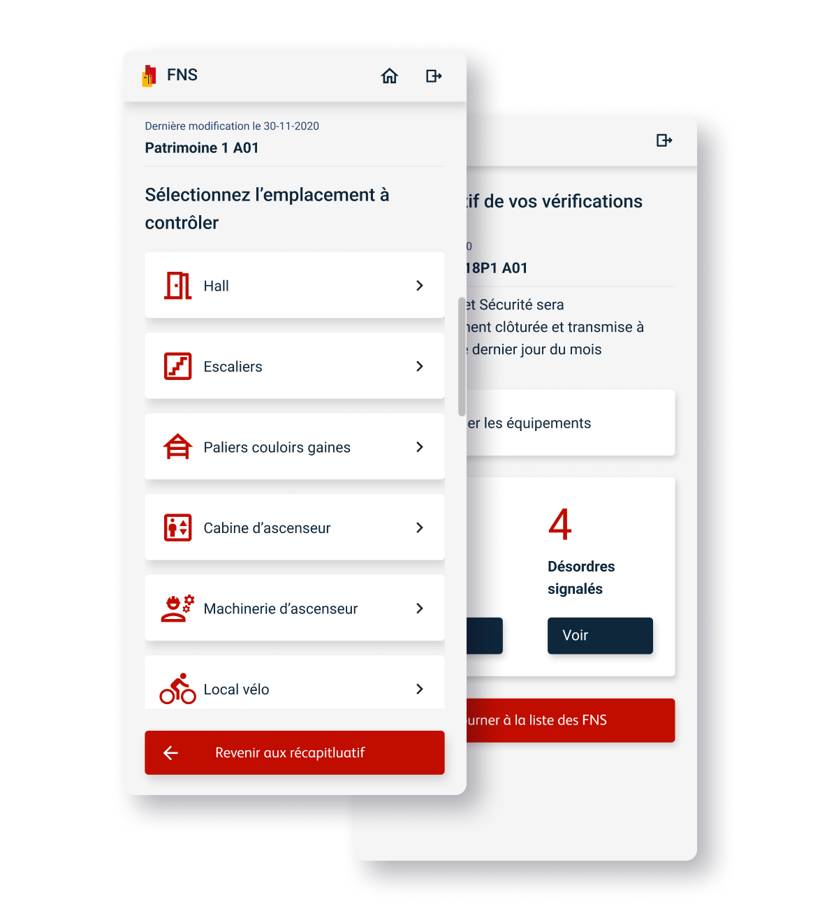
City Social
The client of City Social requested creating a mobile app specifically designed for Samsung Galaxy A50, meant to simplify the process of taking some of the bureaucratic parts of social caretakers’ jobs to digital. Some of the special requests were to make this app accessible to people with hearing, reading, seeing, learning, and cognitive disabilities.
1 mobile app 5 sections 100+ screens
Goals
The main objective of the project was to create a platform for the buildings’ caretakers to fulfill their tasks digitally. The secondary goal was to create a very accessible medium for our target group.
Target
The application was tested and created for a user persona consisting of person in his 50’s/60’s, having poor to medium formal education. The person is not a digital native and often times finds it difficult to keep up with technology.
Problem
& Solution
The problem the app solves is moving the check-up process done by the buildings’ caretakers from analog medium to digital.
The solution is creating an app by using a design system that passes certain accessibility tests so that the caretakers make the transition in an easy way.
01
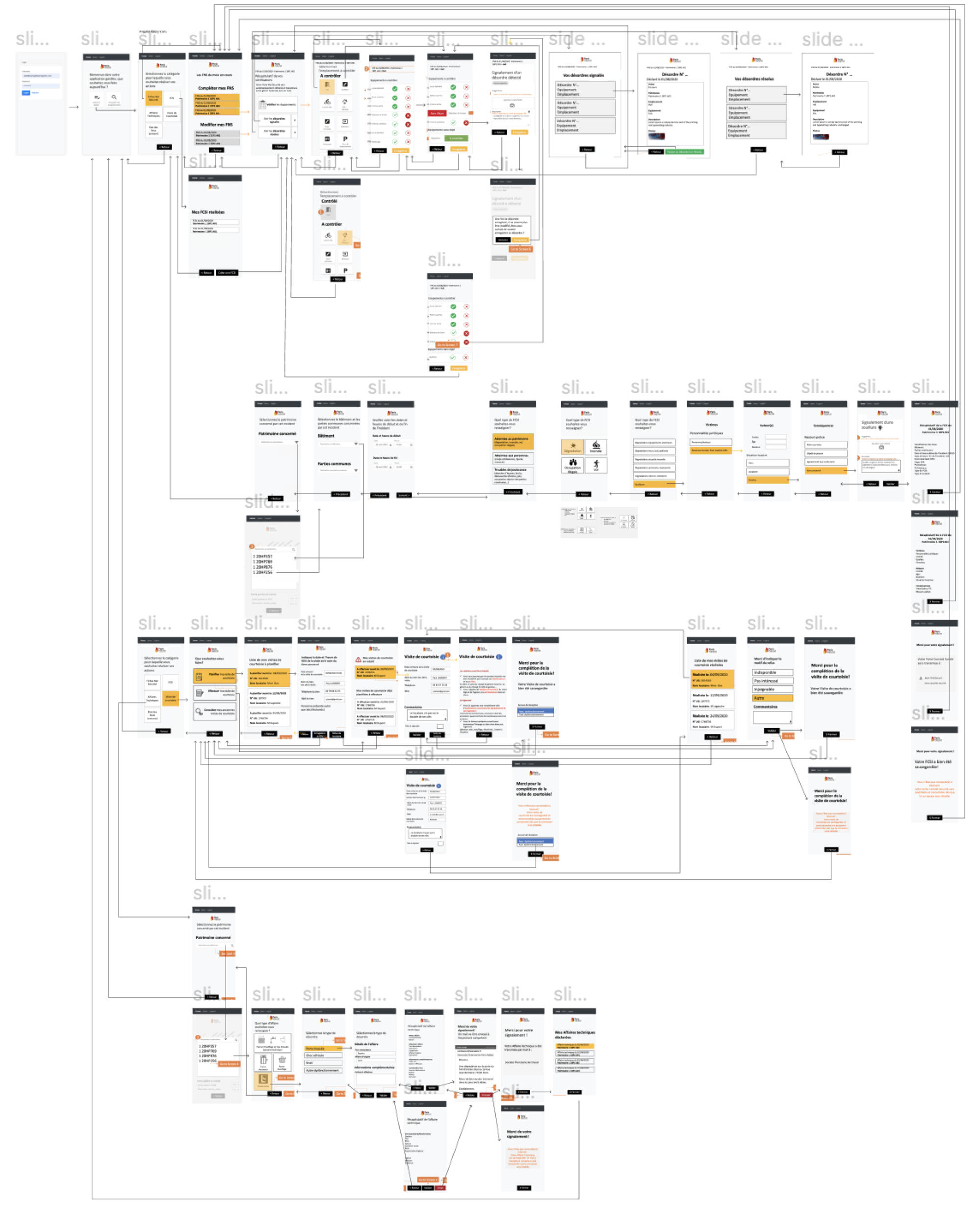
The project naturally broke down into 3 phases of development. The V1 was primarily a proof of concept, aiming to put together all the different features the client initially requested, based on potential users' feedback. The goal was to create a simple prototype made out of wireframes, that would help me and the business analysts test those initial features with some of the future users.
02
My role included aiding the analysts' team with exploratory workshop exercises ideas, meant to address user pain points. After analyzing the main findings, I started sketching some low fi wireframes in order to gain feedback on the general design direction (user journeys, flows). After feedback and pain points came through, I modified the sketches into high fidelity wireframes that further aided to an MVP.
03
Further on, I worked on creating a design system that would match the branding (a logo that already existed) and made sure everything is accessible and met usability standards. The designs were tested and approved, with the changes being applied all over the project and thus, a V2 with more features was created.
General Accessibility
Differentiating form fields by using outlines, assistive text and always showing labels.

Using assistive text, labels and icons as usability enhancements for actions and alerts.

Reading and Learning Disabilities
Designing for Dyslexia, ADHD, Processing Deficits.
Avoiding italics or underlines, using bold instead.
Avoiding centering the text, using left justification instead.
Adding images and pictograms instead of text to make the design more accessible.
Support text with icons whenever possible.
Keeping lines of text short. Studies show that it is best to stick up to 45 characters in a line.
Keeping it simple. Not overloading screens with distracting graphics.
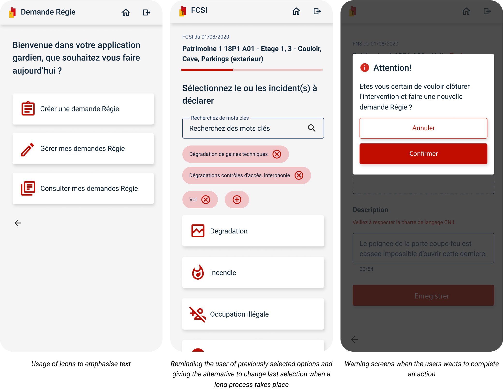
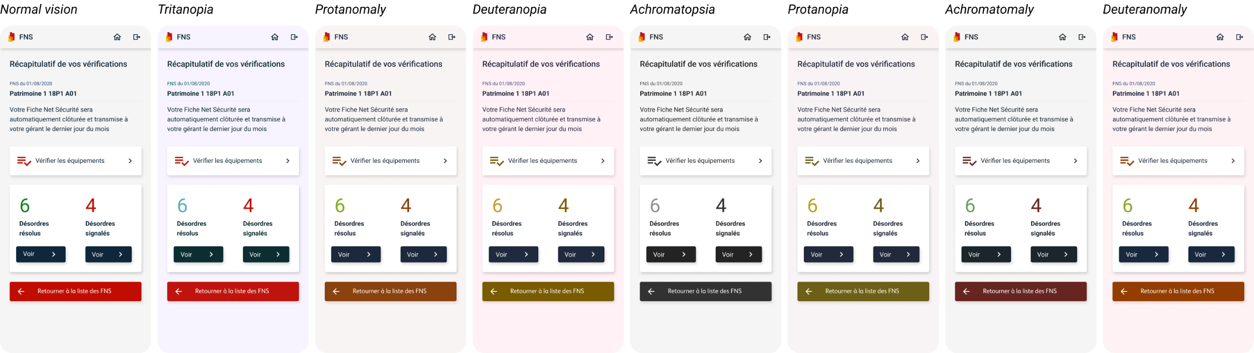
Vision Impairment Tests
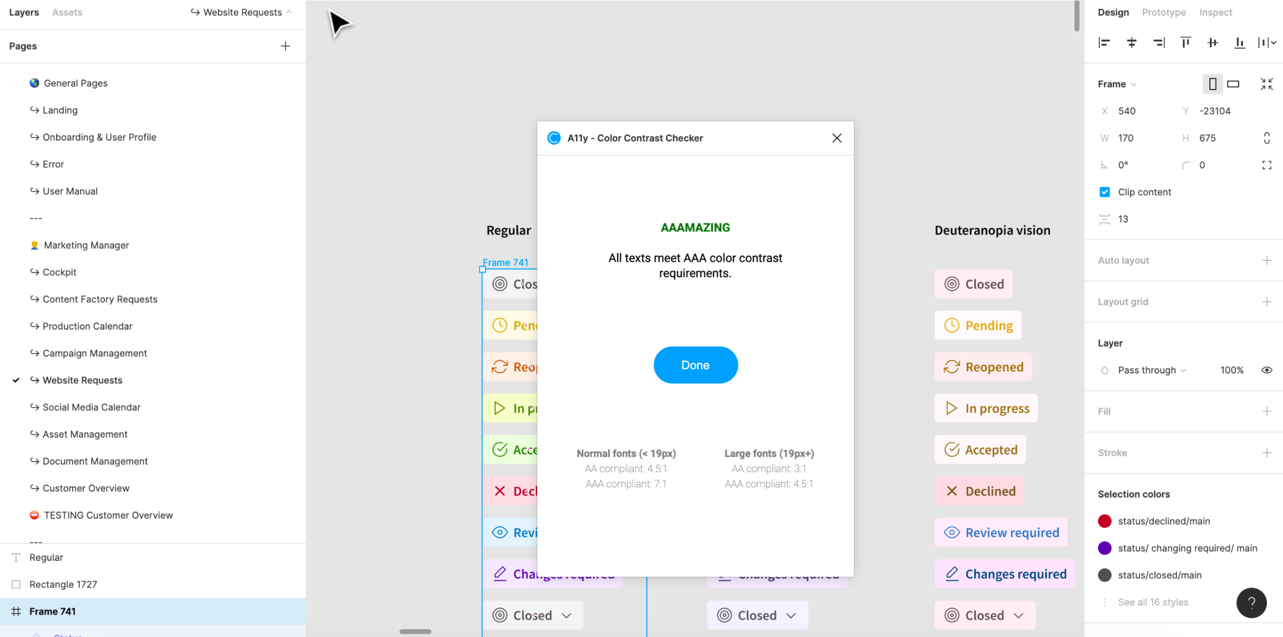
Passing the 16 most common vision impairments and colour blindness tests. Passing Microsoft and A11Y colour contrast checkers.
Colors
#C00D00
Main
Buttons
Icons
#FBBA00
Secondary
Highlights
Secondary cards

#FBBA00
Text
Headlines
Body text

#158023
Alerts
Success
Confirmations
#E30613
Alerts
Warnings
Errors
#1F4F76
Labels
Labels
Hints
Typography


Iconography
Most of the icons used are from the Angular Material, which is also an Open Source Library.
Results
Learned to design specifically for Android
Learned to design for certain disabilities and disorders
Easy to follow processes for the building caretakers to follow
Designed in a language I don't speak
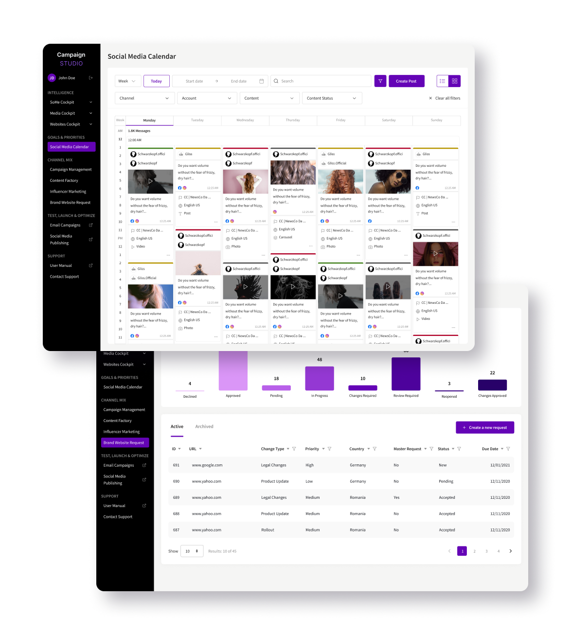
Campaign Studio
The Germany-based client is a major consumer and industrial goods group, with noted international brands that have obtained globally leading market positions. Operationally, the multinational is organised into three business units: Laundry & Home Care, Beauty Care, and Adhesive Technologies. Its employees, around 50 000, mostly work in locations outside its home base.
Brief
Create a web product that helps internal employees from said business units collaborate with external contractors and advertising, media and communication agencies.
Problem
The Client needed a way for their employees to have a documented digital back and forth communication with agencies, in order to release advertising campaigns, social media content and promotional content in general. This kind of data needs to be trackable and measurable, in order to generate KPI’s.
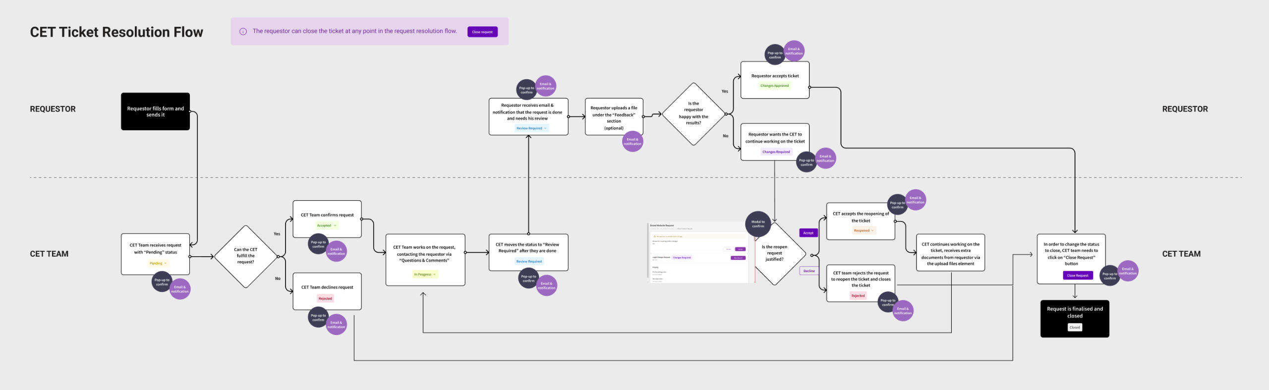
Solution
After numerous client and user workshops, competition analysis, sketches and MVP proposals, Campaign Studio was created. Starting as a Campaign Management Tool in 2020, it quickly evolved from a DAM integrated solution into a much more complex tool that does benchmarking, campaign creation and management and, wants to become an e-commerce solution by the end of the next year. The app was developed in modules, each one of them being designed by a team of 5 designers following Agile workflows and practices.
My Tasks
I joined the design team on the project at the beginning of 2022, full time, two years after the release. In my half a year on the project, my completed tasks included the following:
Accessibility
I did accessibility improvements, some of them being verifying and modifying colour schemes and checking contrasts all over the project.

Problems
The design was outdated and missed features users were needing. The task I was assigned to consisted of addressing the following users’ pain points:
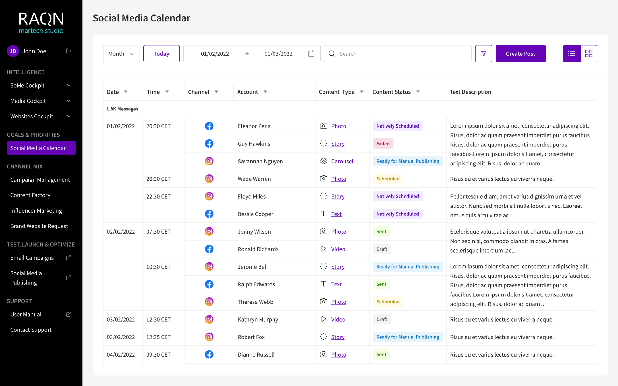
Users needed a month view and a list view of the calendar
Users needed to filter entries
No possibility to see all post info besides the calendar entries preview
Entries didn't contain the info needed by users, but just copied another platform's template
No information hierarchy
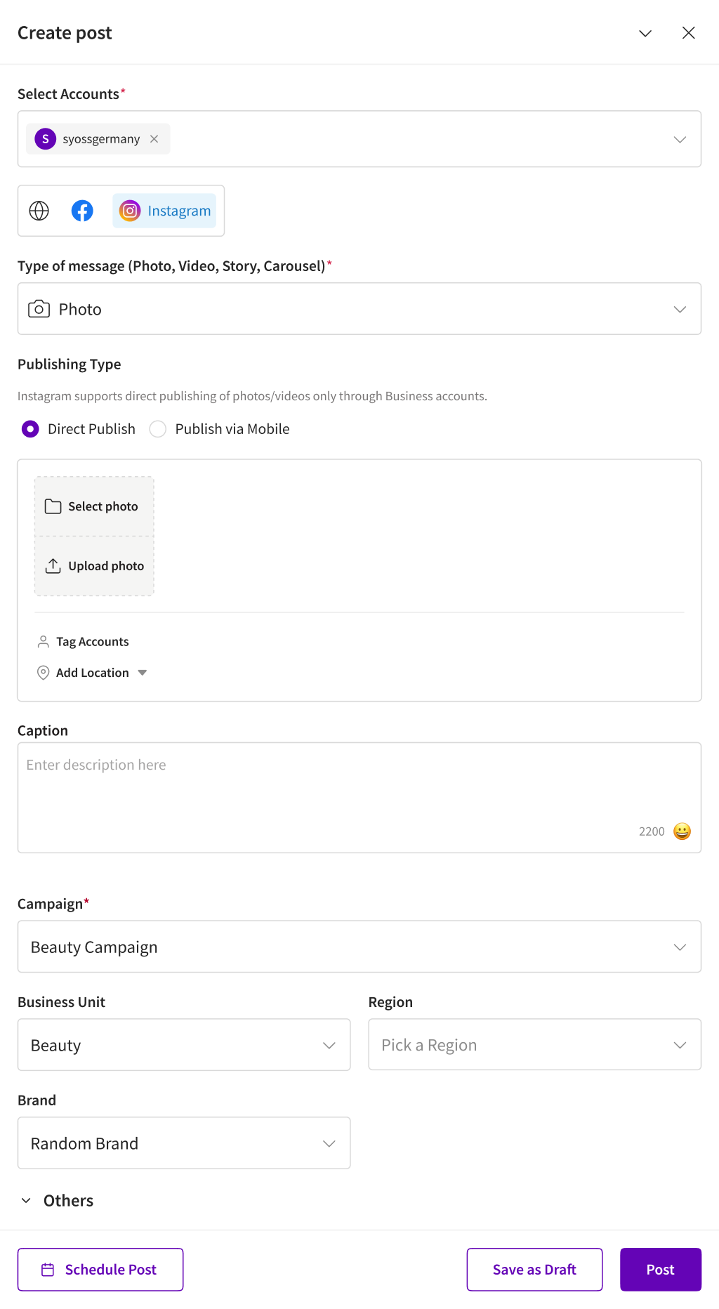
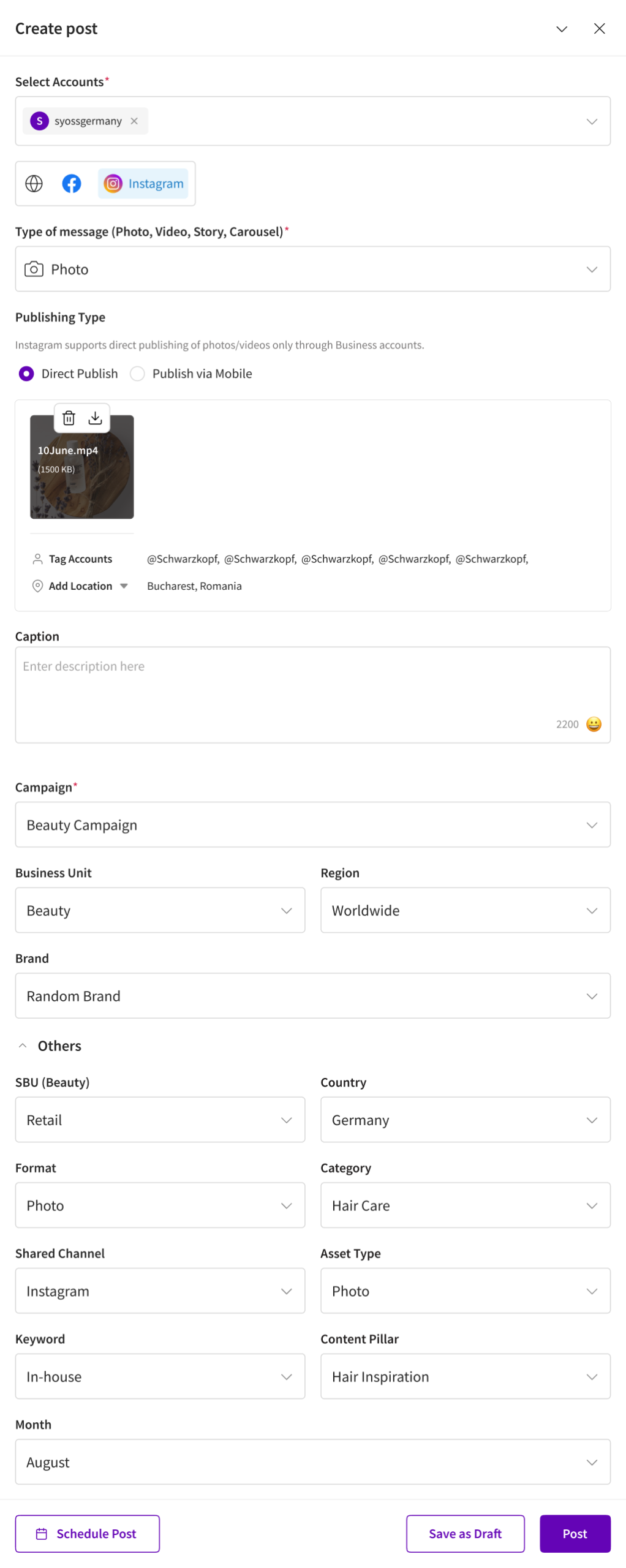
Social videos, stories, carousels could not be posted directly from the platform
Solution
As a result of user interviews, client workshops and research, I’ve designed a series of features that users needed:
Created month and list views for the calendar
Created status bars for the missing content types
Adjusted information hierarchy of the entries
Created an expanded view of the calendar entries, so users can preview more information
Redesigned photo posting masks
Added filters for channels, content and status
Changed icons to align with the brand styleguide
Made the design responsive
Created posting a mask for videos, stories and carousels
Process
01
User pain-points
Users reported usage difficulty and needs to Business Analysts (BA’s).
02
Making Contact
BA’s presented said problems to design team and gave contacts of users for further discussions with them.
03
Project Research
Basic research on the product and competition was done before contacting users.
04
User Research
Contacted users and had some exploration and problem defining workshops
05
Wireframes & Ideation
Used research results to create wireframes of said calendar and tested the prototypes with the users.
06
Design & Hand-off
After adjustments, reviews and approval of users, BA‘s, developers and client, designed and handed out the solution
Week, grid view, filters on
Redesign of the original calendar page and entries, featuring posibilities of filtering, having different viewports, showing number of entries.
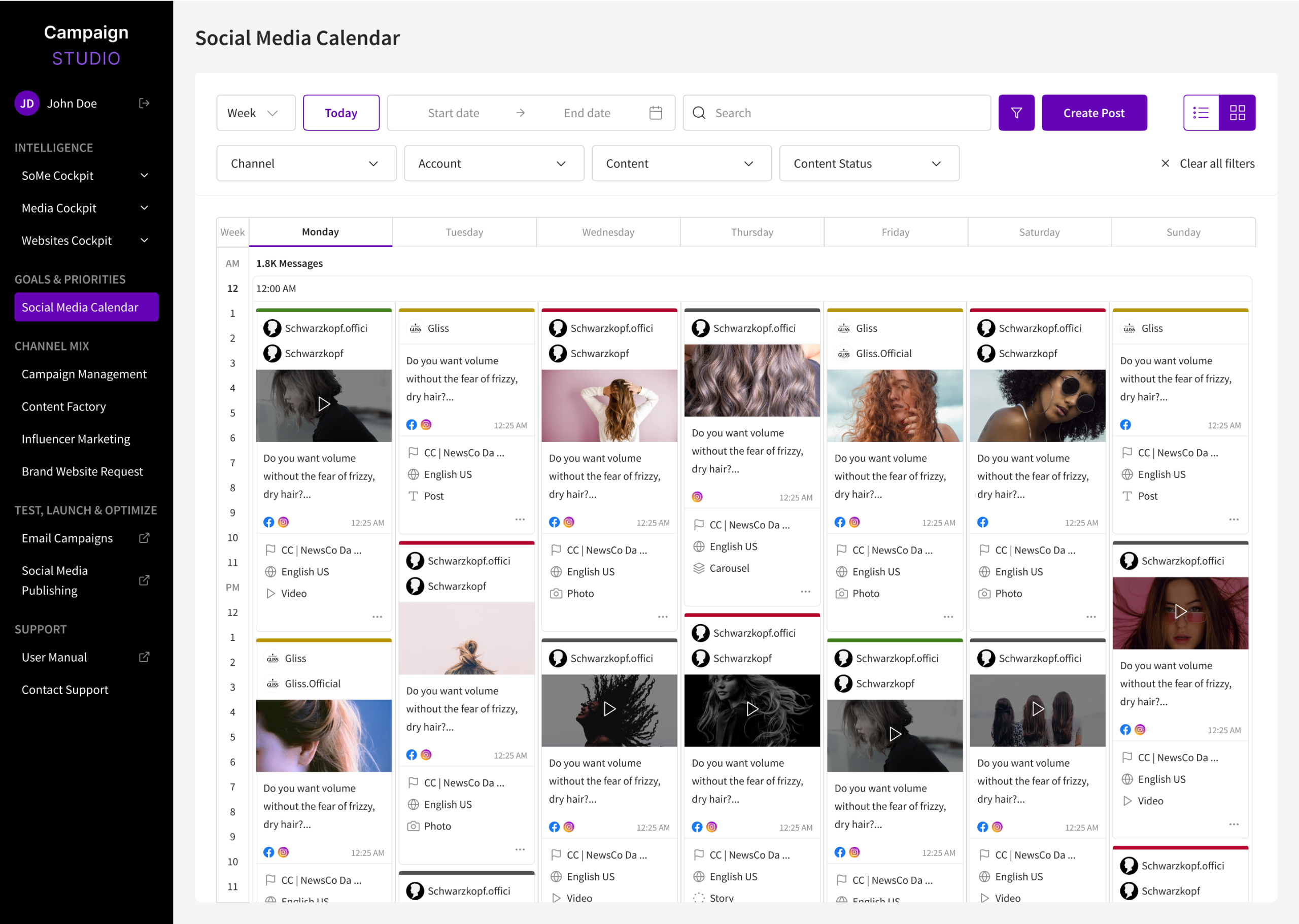
Month grid view
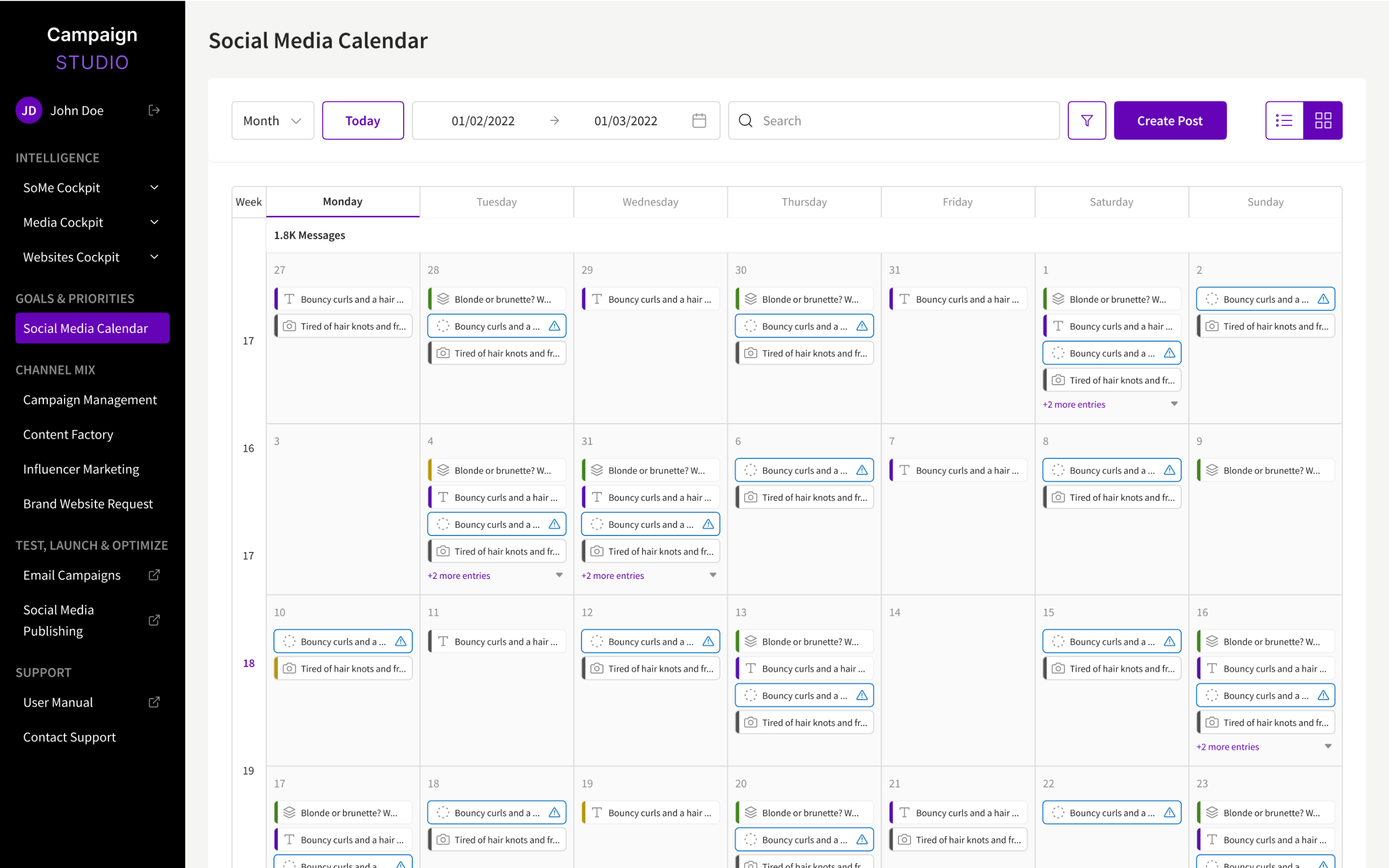
Month list view
New entry creation mask
Added the possibility of uploading carousels and stories, account tagging and location adding.
Results
Redesigned the whole Figma project workflow: I migrated the single Figma page draft (that contained over 100 artboards, as the whole project is huge) to a Figma project, with each site section having a dedicated File in the Project.
Created components rules so the whole team of 5 designers could cooperate and work together while respecting the same guidelines
Convinced client and business employees to have a recurring design audit together with testers, that we’d later present to developers for fixes once every 6 sprints
Coordinated user interviews and workshops
Held workshops on teamwork and healthy feedback, as there was tension in the design team caused by the different work styles
Redesigned the Social Media Calendar so that it addresses user pain-points and general feedback
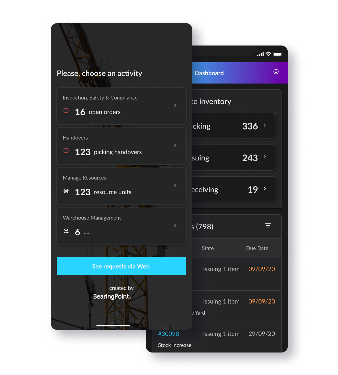
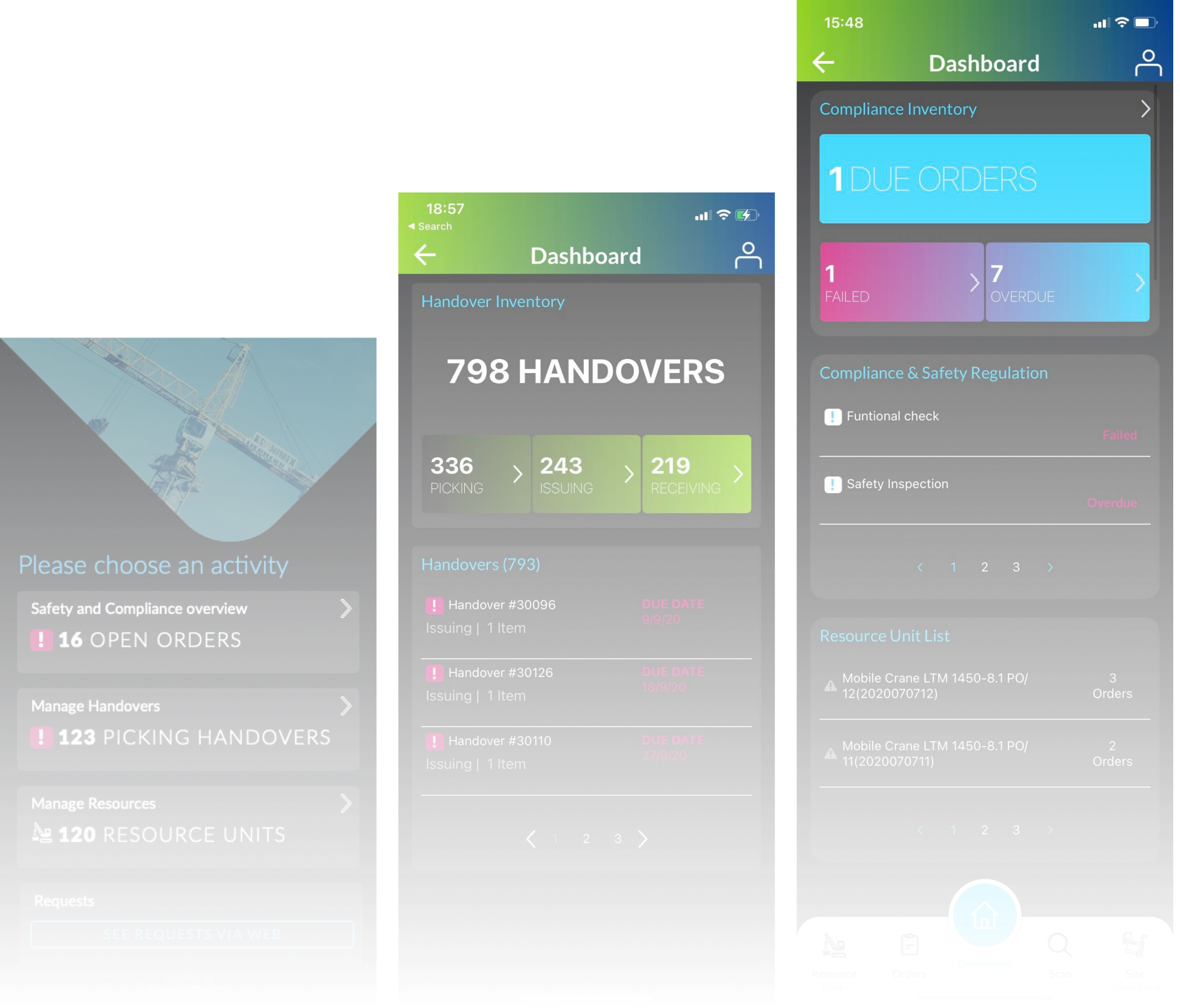
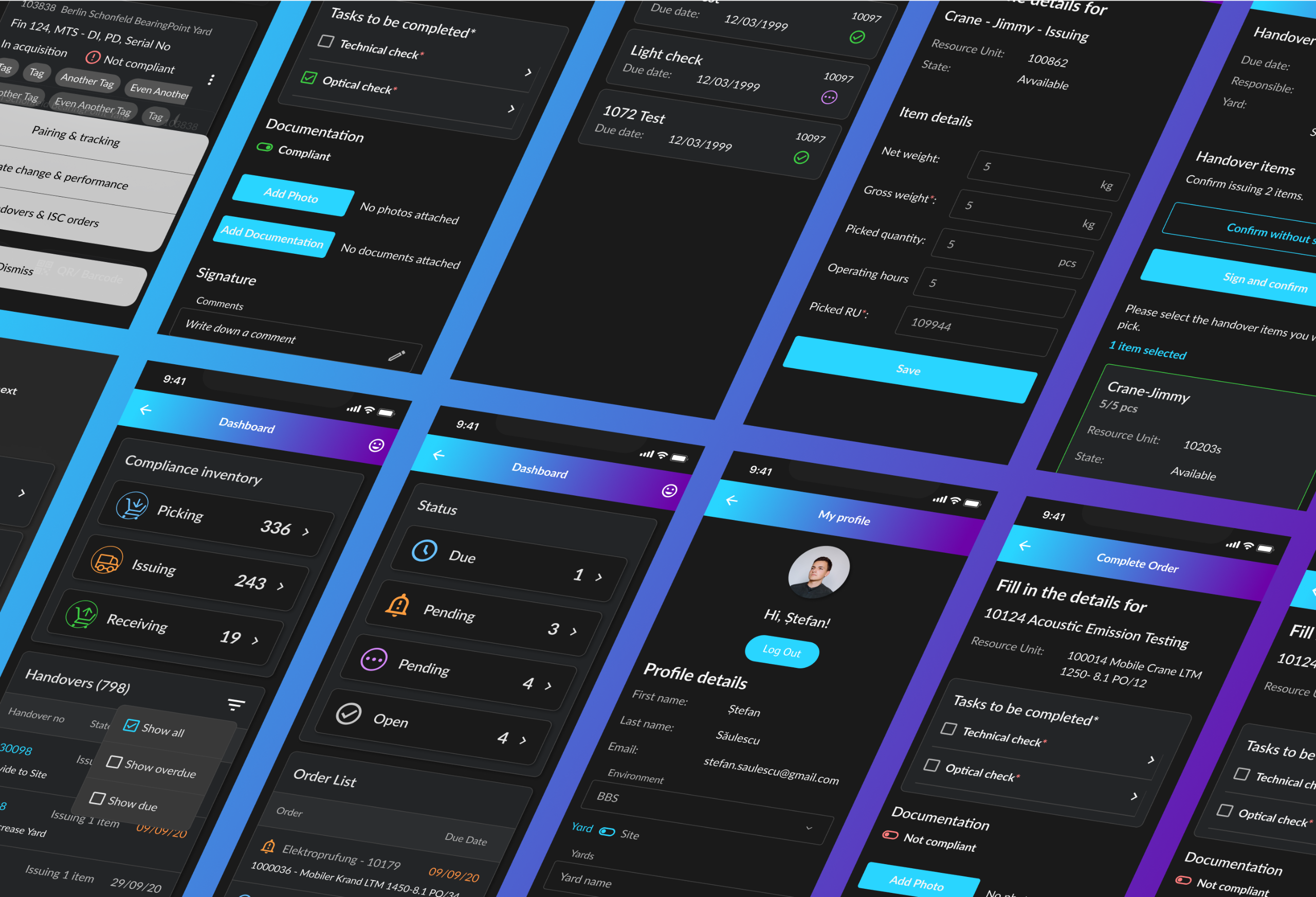
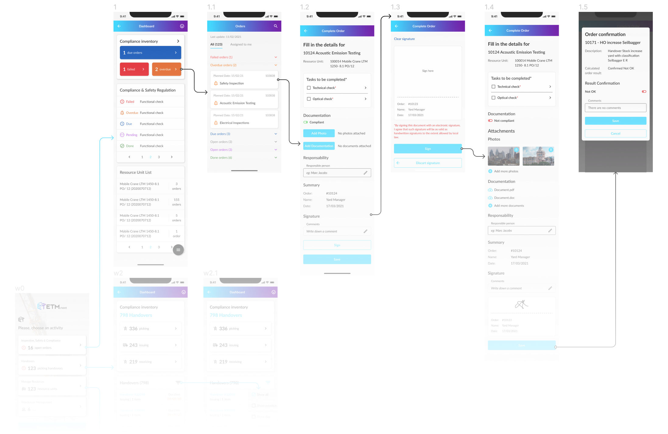
ETM.next
Germany-based client, ETM.next covers the end-to-end process for fleet and rental use cases providing comprehensive mobile solutions for requesting, planning, dispatching and billing as well as full life cycle management for critical assets.BearingPoint Wins 2021 SAP Pinnacle Award in the Partner Application of the Year – Industry Cloud Category
Problem & Brief
Before my arrival on the project, ETM has been initially developed as an MVP, consisting of only few of the sections that it now has. The app‘s features and usage grew bigger in a short time span, making the design system initially created hard to use and difficult to cover all the new usability problems that arose.My primary job was to create a flexible design system and components set that can be easy to use by developers, as there was no permanent designer on the project.Secondly, I had to fix the flow problems that the initial design had, making it hard for users to keep track, use and add data.Another difficulty I faced was the lack of interaction with real users, the feedback from them arriving only after the development and release of the app versions, through the client and stakeholders.
Initial MVP
Designs
Solution
In response to the challenges and trends in the construction industry, such as low on-site productivity, insufficient utilisation rates of equipment, and digitalisation of processes, ETM.next has been developed.The equipment and tools management solution is fully integrated into the SAP landscape and offers cutting-edge features: a webshop, a comprehensive planning board, and a native mobile app. It’s supporting processes like order/invoicing, assets or inventory management independently from the applications you use.
My Contribution
I was the sole designer working on this award-winning app. My responsibilities on the project included:
Design Audit & design system revamp
Redesign of old mobile sections and designing of new sections and features
Accessibility testing (the client asked for both light and dark versions, + focus on the fact that the app will also be used in harsh conditions, such as on working sites)
Creating personas, user flows and journeys
In-house A/B testing, and discovery workshops (with stakeholders of the app)
Client and business analysts presentations and reviews in order to get feedback, as access to users was not possible
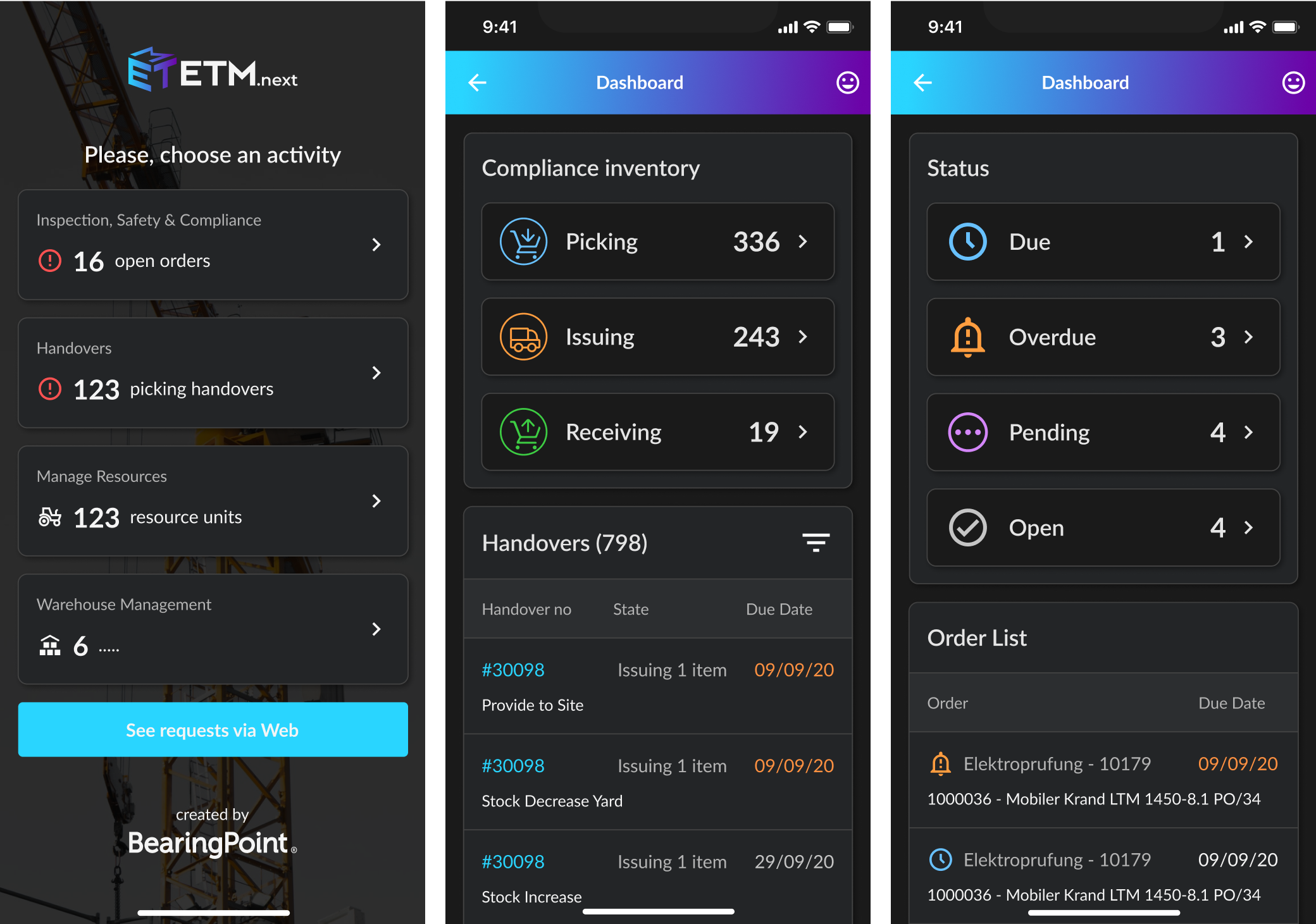
Tasks & Flowcharts
The app has various workflows that needed to be tested and optimised according to user needs and respecting rigurous client specs.
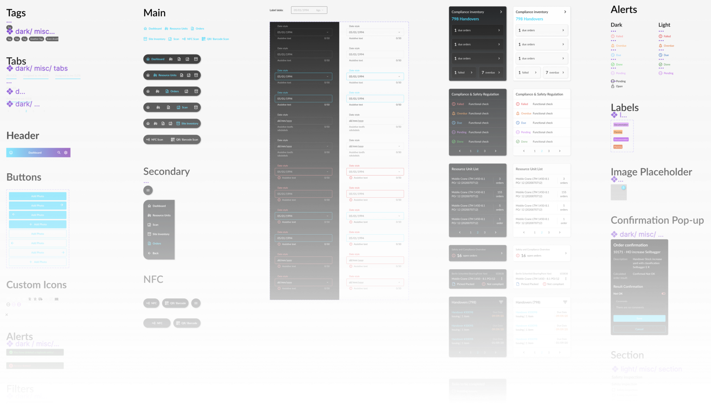
Dark & Light Color Schemes
The client asked for both light and dark versions due to the users working is a wide variety of different environments, in different lighting conditions.
Design System
I had to create a flexible design system that could be easily used by business analysts, product owners and developers, as there were no resources of hiring a full time designer on the project. From time to time, I was commissioned to create custom solutions for problems that arose along the way.
Results
Created a flexible and easy to use design system
Successfully presented solution to client, although I didn’t have access to real users
Easy to follow processes for the users
Gave further consulting advice when there was no budget for actual design
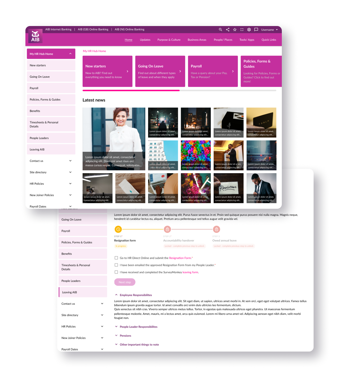
AIB
One of the biggest banking entities in Ireland, Allied Irish Banks offers a full range of personal, business, and corporate banking services. They also offer online banking services, as well as an intranet website developed for the employees of the bank.
Problem
& Brief
The existing intranet was outdated, inaccessible, incomplete, and difficult to navigate.
Another problem was that the previous online resigning / leaving process was incomplete, redirecting employees to eventually phisically go to the office to leave their resignation papers. This was a problem in times of Covid lockdown, as healthcare officials advised the public to avoid getting out of homes and some employees were working remote anyway.
Boundaries
Design within the constraints of an outdated stack (SharePoint). Some trivial features were impossible to implement.
Some parts of the UI could not be changed in any way
I had NO access to the platform. I had to work with screenshots.
No real users to test on; only internal stakeholders.
Solution
A solution to usability problems was to restructure the most used site sections: the ones regarding HR processes and the ones that contained information about role responsibilities. To create an overwall more user friendly experience, I proposed a layout change for the information to be more easily recognisable.In order to make the leaving process easier, I‘ve made it shorter and turned it into a wizard, so future ex employees always know what steps have been already completed, where they‘re at in the process and what is going to follow.
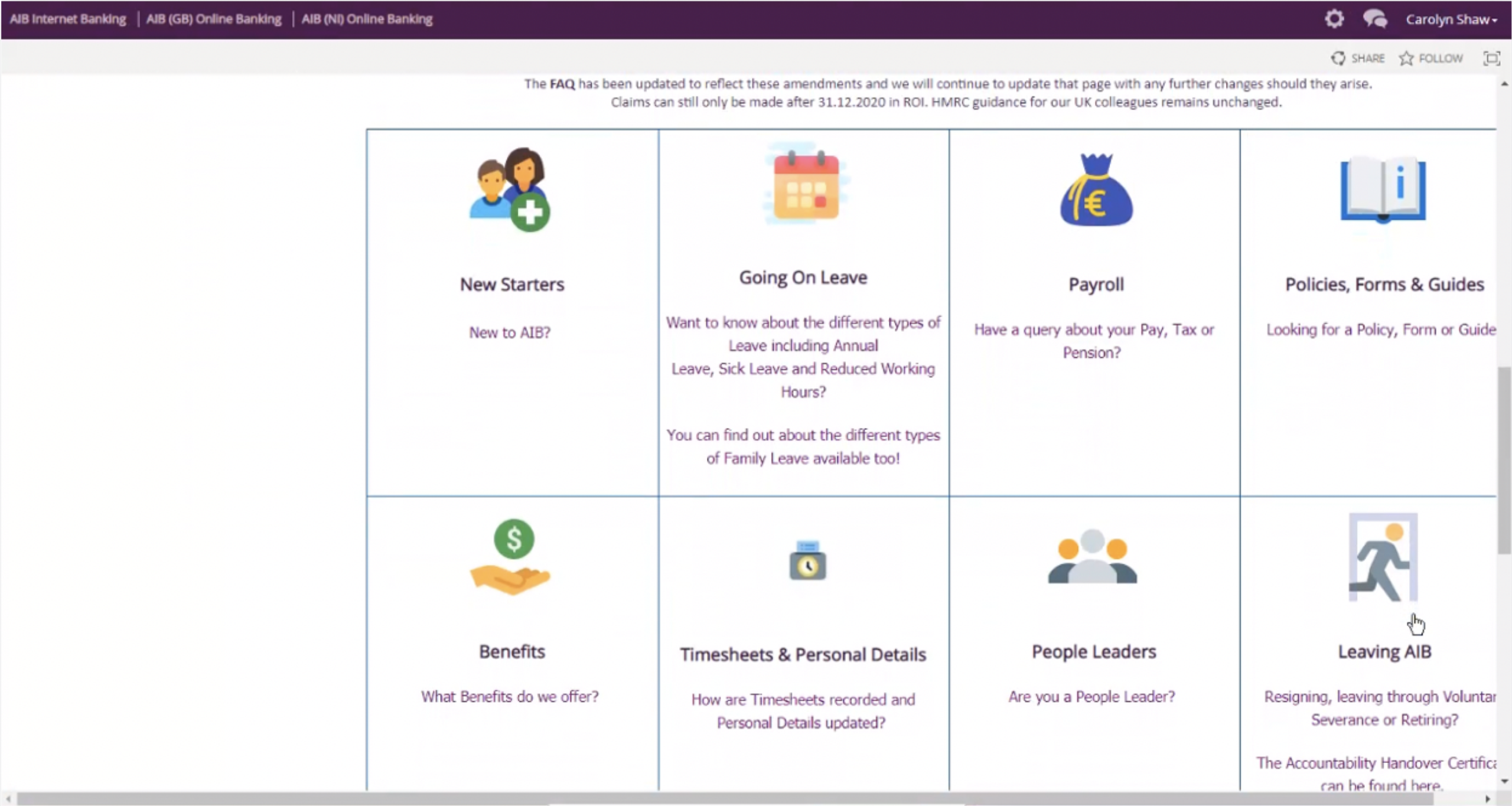
Old HR Hub page
Users had to scroll down to find the “Leaving AIB” tile, then click it. Action tiles had no visible action buttons or indicators.
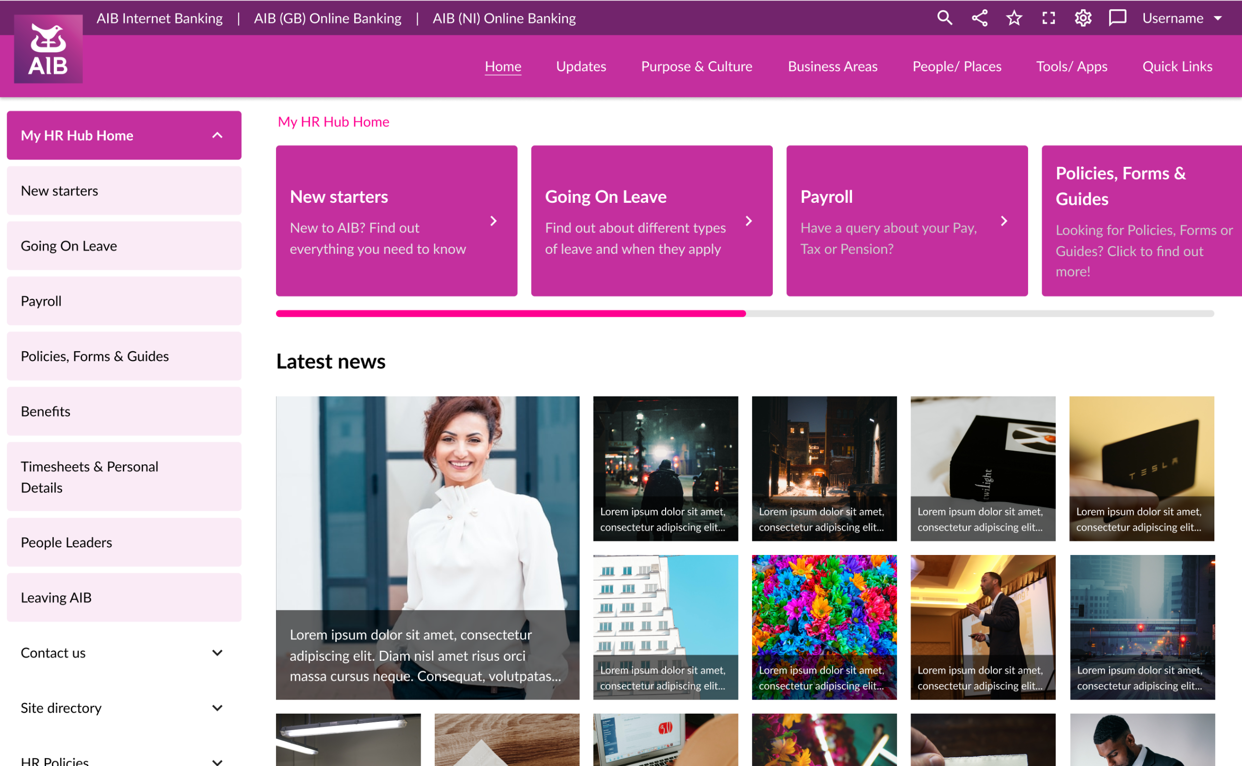
New HR Hub page
Redesigned menu and layout; changed information architecture both as a process and looks on landing pages: most important info was placed upper in the page hierarchy, making the news articles more recognizable).
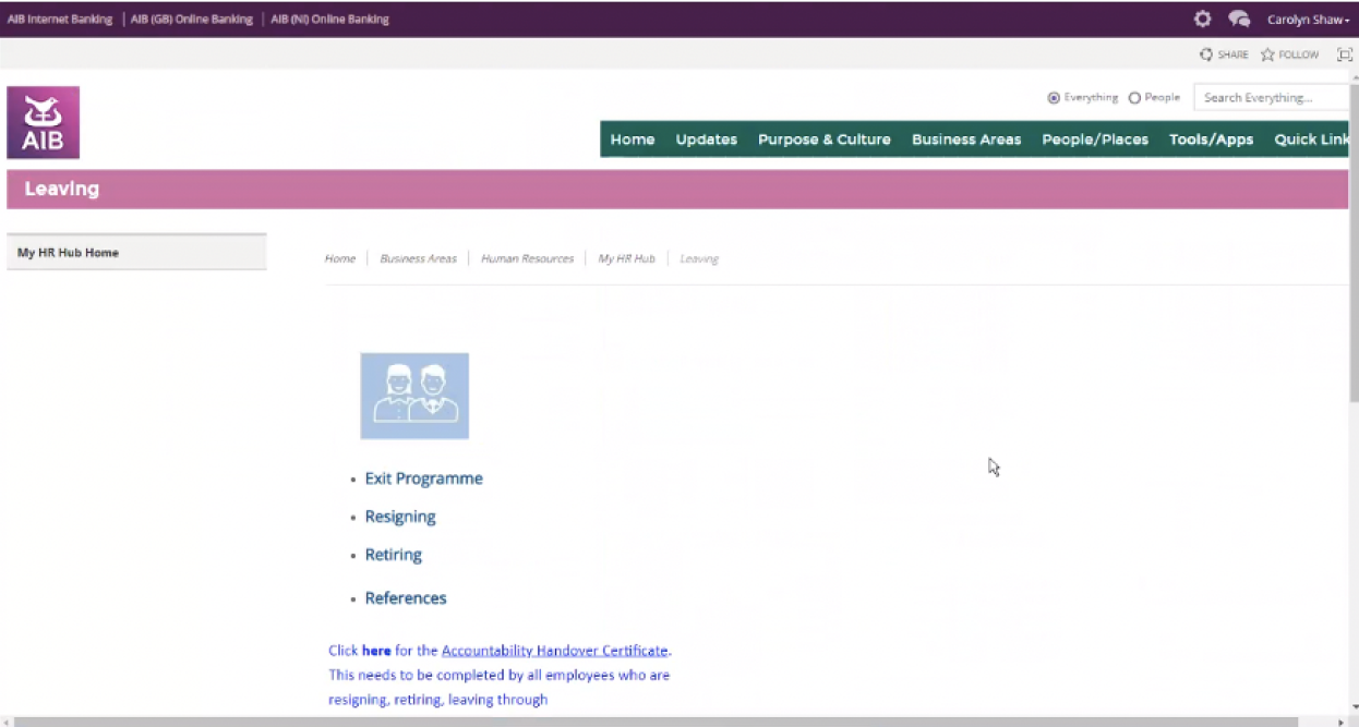
Old Leaving AIB page
Scroll down to Accountability Handover Certificate to get links for the PDF and Word versions of it.
Click resigning (problem: some employees may click on “Exit programme”.
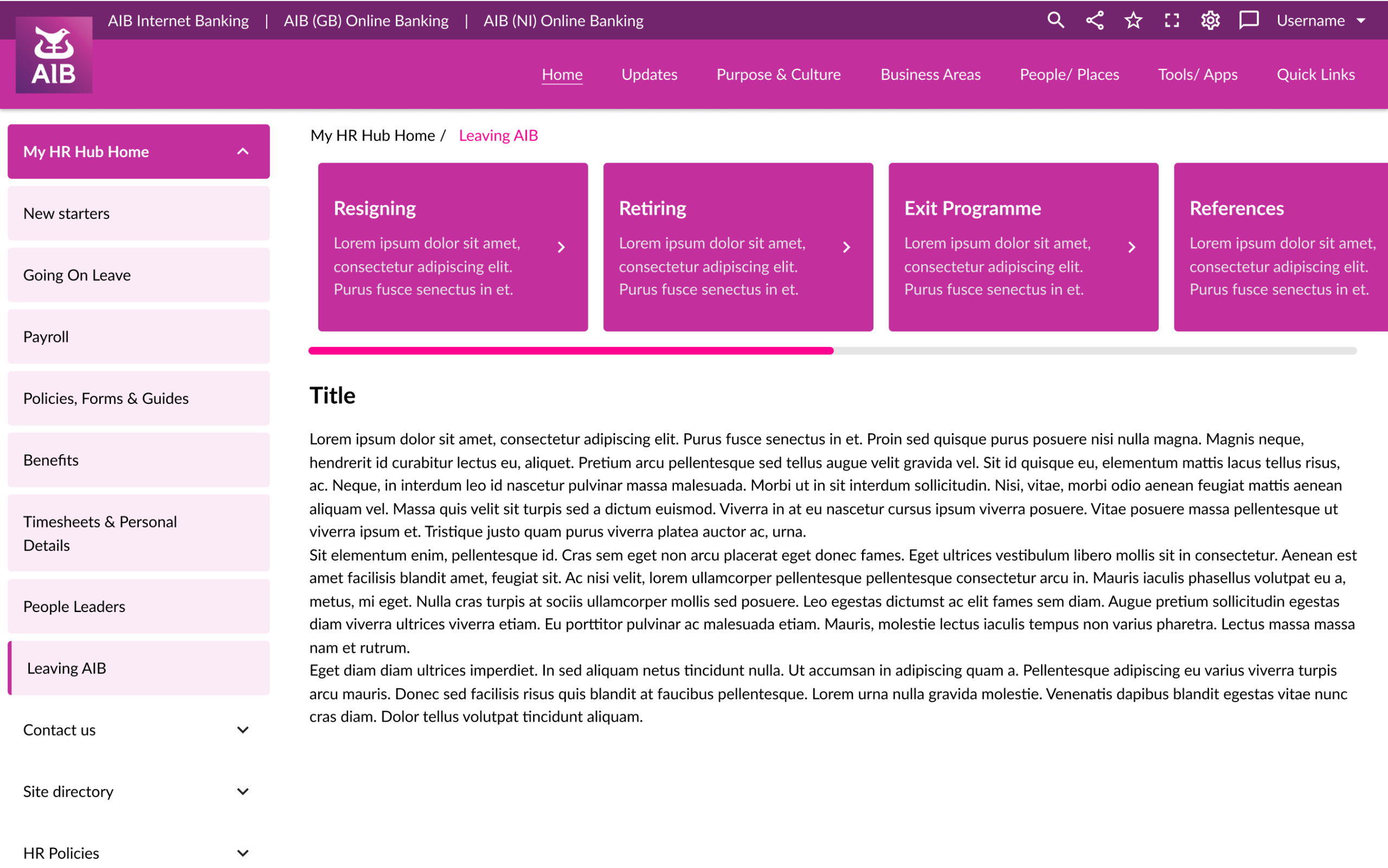
New Leaving AIB page
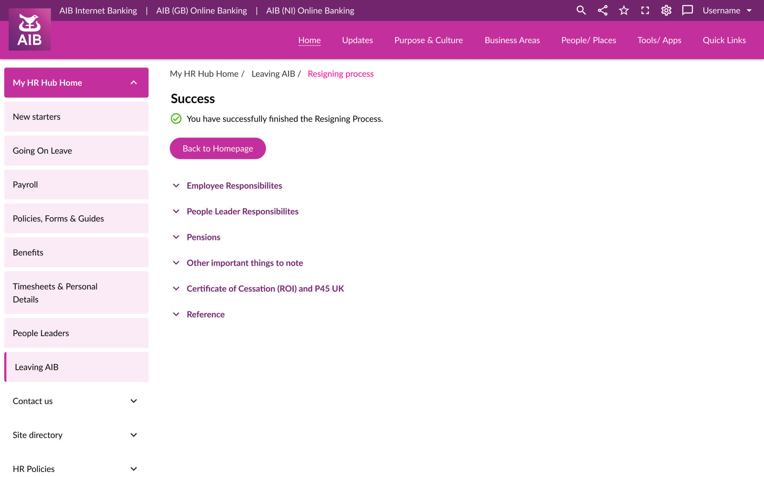
Less dissonant, 1-click Resigning.
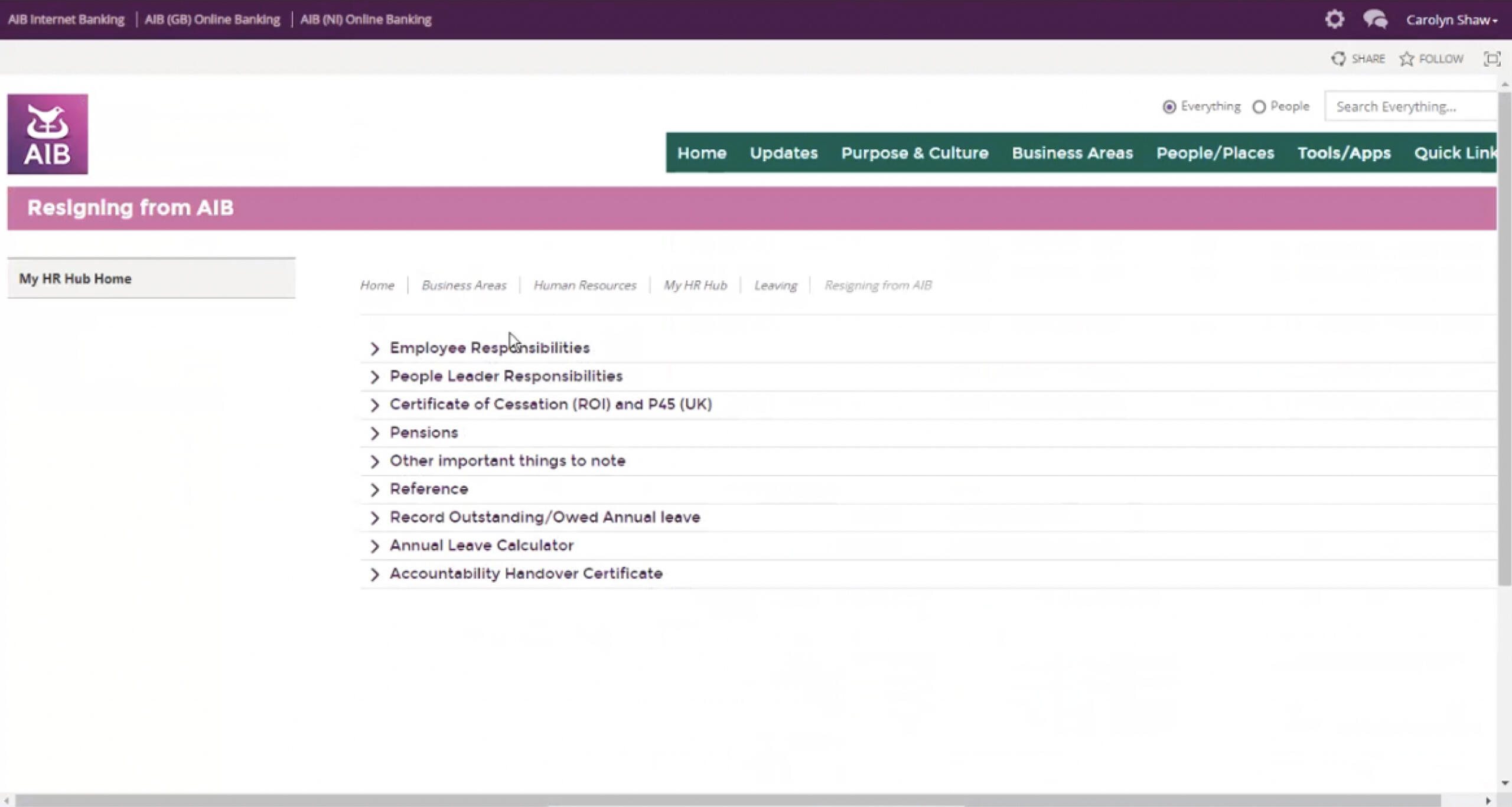
AIB HR Hub
Redesigning the landing page
Executive employees should click "Employee Responsibilities" for more info. Managers (People Leaders) should click “People Leader Responsibilities”. Process stops here, as employees are required to contact HR and manager in order to resign.
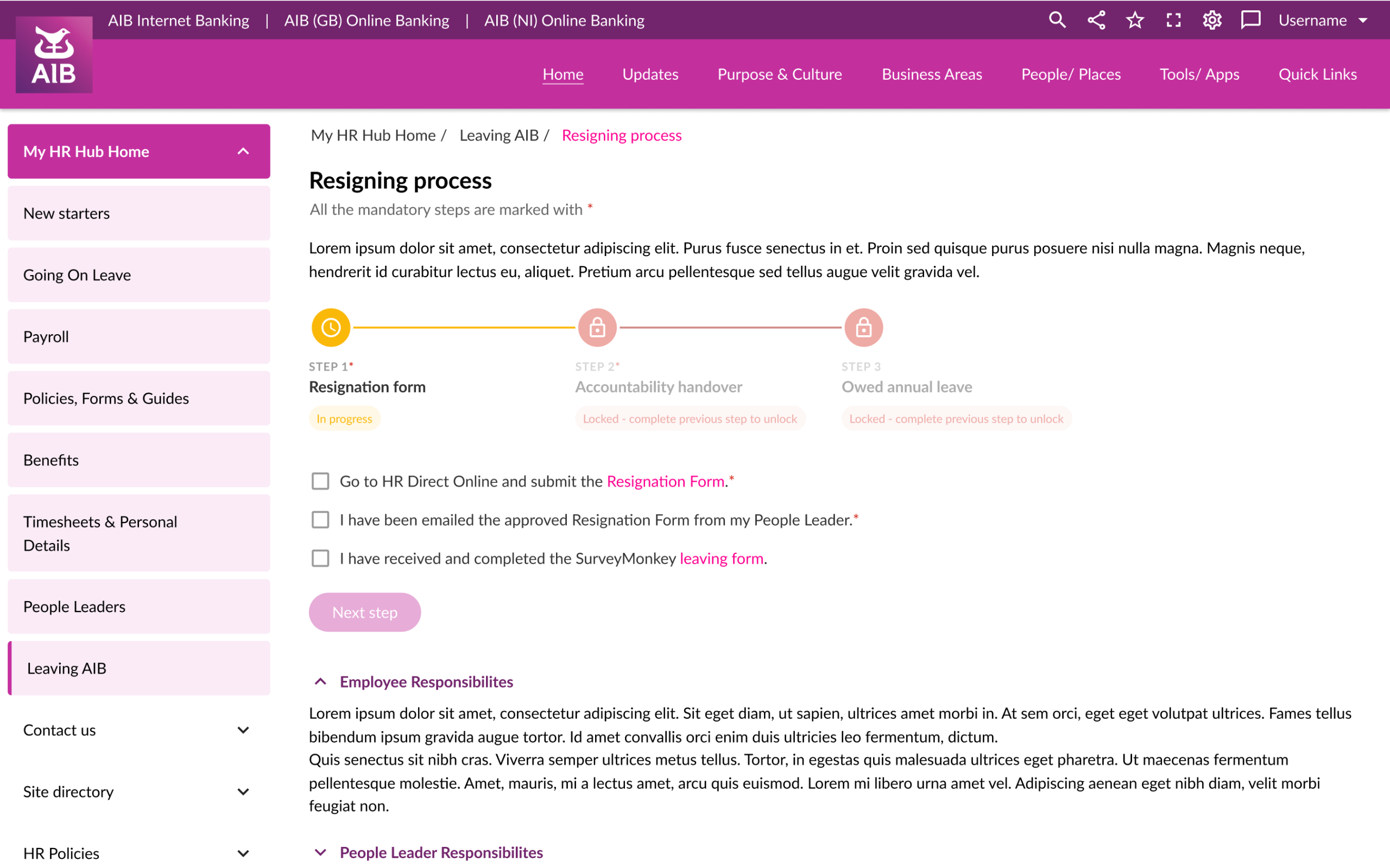
New HR Hub page
Users can now proceed as instructed in the guided wizard. When finished, they get a clear confirmation message.
Results
Designed a new Resigning Process that would also work for people working remotely
Redesigned HR Hub as well as other sections of the old site
Restructured the information hierarchy and redesigned the homepage